
David Okafor, Senior Health and Science Editor.
You are standing in front of the bathroom mirror on a Tuesday morning, and the drawer in front of you holds six eyeshadow palettes, four of them barely touched. Somewhere in there is the one you reach for every single day, the one your fingers find without looking. The other five looked exactly as good under the store lights. This guide is about closing that gap: learning to tell, before you buy, which palette will earn a place in daily rotation and which one will end up as drawer clutter.
One fact worth knowing before anything else: pigment concentration, not pan size or shade count, is the single biggest predictor of how a shadow performs on skin, and you can test for it in under a minute at the counter.
- Daylight, not store lighting, reveals true undertone and finish. Swatch near a window or a doorway before deciding, since fluorescent and jewelry-counter LED lighting distort color in opposite directions.
- A one-swipe test predicts wear better than any claim on the box. If pigment shows clearly on the first light pass, it will likely hold up through the day; if it takes four passes, expect to reapply by lunch.
- Finish and formula quality matter more than shade count. A well-bound six-pan palette will outperform a poorly milled forty-pan set every time.
Finding Your Undertone Before You Pick A Palette

Most shade confusion is a lighting problem, not a skin problem. Store lighting typically runs warm and yellow under older fluorescent tubes, or cool and blue under the LED strips built for jewelry counters. Neither matches ordinary daylight, which is what your coworkers, your dinner date, and your phone camera will actually see.
The fix is simple. Swatch on the back of your hand or your inner wrist, then walk toward a window or step outside for ten seconds. A recent testing survey run by the Good Housekeeping Institute found lighting conditions to be among the top reasons shoppers returned color cosmetics, ahead of both allergic reaction and price regret.
This matters most for fair and deep skin tones, where cool store lighting can wash out or oxidize a shade’s true tone more dramatically than it does on medium skin. If you cannot leave the counter, hold the swatch near a doorway or under a skylight if the store has one, and avoid judging color under warm incandescent bulbs entirely; they flatter everything and tell you nothing true.
A quick self-test: swatch two shades side by side on your wrist, look at them under the store’s lighting, then check your phone’s front camera with flash off. If the colors shift noticeably, trust the camera over the mirror. Phone cameras use a more neutral white balance than most retail lighting, closer to what daylight will actually show.
What Pigment Payoff Really Means
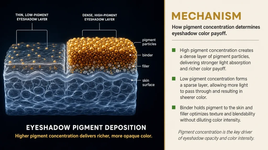
Every eyeshadow is essentially colored pigment suspended in a binder, the same basic principle behind house paint. A wall painted with pigment-rich paint covers in one coat; a thin, cheap paint needs three coats and still looks patchy. Eyeshadow behaves the same way against skin.
The ratio of pigment to binder and filler determines how much color transfers with a single swipe. High-pigment formulas need less product and fewer passes of the brush, which also means less fallout landing under the eye. Low-pigment formulas rely on repeated layering, which increases both mess and the chance of visible creasing later in the day.
Formulation chemists generally point to talc and mica fillers, not pigment itself, as the ingredients most often diluted to hit a lower price point. Filler is not inherently bad; every palette needs some for texture and slip. The question is proportion, and proportion is invisible on an ingredient list, since cosmetic labels are not required to disclose exact percentages beyond the first few ingredients listed by concentration order.
This is also why a single well-made shade can outperform a forty-pan set. Manufacturing forty distinct pans profitably almost always means diluting pigment somewhere in the mix, because pigment is the expensive part of the formula.
The Three-swipe Test You Can Do At The Counter
You do not need a laboratory to judge pigment quality. You need a clean brush or a disposable applicator and about ninety seconds.
Swipe the shadow once, lightly, the way you would apply it at home, not pressed hard into the pan. A well-formulated matte should show visible, even color on the first pass. If it takes three or four swipes to see anything, the pigment load is thin and you will likely be reapplying by lunchtime.
Next, run a finger lightly across the swatch. Some looseness is normal, but if a visible cloud of powder lifts off with light contact, expect similar fallout under your eyes during home application. Finally, press a cotton pad against the swatch and lift it straight up. Heavy transfer, more than a faint trace, suggests the shadow will also shift and transfer unevenly on eyelid skin rather than sitting where you placed it.
None of this requires buying anything. Most counters, including Sephora and Ulta Beauty, expect swatching and stock testers for exactly this reason. If a shade family interests you, test the lightest and the darkest shade in it, since the two ends of a palette are sometimes formulated slightly differently even within one set, and results can read very differently across fair, medium, and deep skin tones.
Where Inexpensive Palettes Cut Corners
Cutting cost in a pressed powder eyeshadow usually happens in one of three places, and none of them is scandalous, just factual.
The first is pigment concentration, already covered above. The second is the binder, the oil-and-wax blend that presses loose powder into a solid pan and helps it adhere to skin. Cheaper binders can leave a chalky finish because they do not melt into skin oils the way a better-balanced binder does. The third is milling, the manufacturing step that grinds pigment particles down to a consistent, fine size. Coarser milling is cheaper and shows up as a gritty texture and patchy blending, especially in shimmer formulas where particle size affects light reflection.
None of these shortcuts make a product unsafe. They affect performance, not safety, and cosmetics sold in the United States are separately regulated regardless of price point. The Food and Drug Administration does not require pre-market approval of color cosmetics, but manufacturers remain legally responsible for safety substantiation, which is worth knowing before assuming a higher price automatically means a safer product. Price tracks performance, not risk.
Drugstore shelves at Target, CVS, and Walgreens carry genuinely well-milled, well-bound formulas alongside weaker ones at the same price point, so the swipe test matters more than which retailer you shop.
Matte, Shimmer, And Metallic: Why Finishes Behave Differently
A matte shadow and a shimmer shadow can share the same brand, the same palette, even the same base pigment, and still behave completely differently on skin. The difference is particle size and shape.
Matte pigments are ground fine and irregular, which scatters light in many directions and reads as flat color with no shine. Shimmer and metallic formulas contain larger, flatter, often mica-based particles that align and reflect light in one direction, the same optical principle behind why a school of fish flashes silver when it turns in unison.
This matters practically because larger reflective particles blend less easily. A matte shade diffuses under a fluffy brush; a metallic sits where you place it and shows every hard edge if you do not work quickly, before it sets. Formulation researchers writing in a 2020 issue of the Journal of Cosmetic Science noted that particle alignment, not pigment color, accounts for most of the difference in perceived shimmer intensity between products.
This is also why shimmer shades show fallout more visibly. The same particle size that reflects light beautifully on the lid also catches light, and attention, when it lands on the cheek. If you want visible shine with less fallout, look for a foil or cream-shifting finish rather than a loose glitter-style shimmer, since foils bind reflective particles into a denser matrix that sheds less.
Blendability: The Skill Test Hiding Inside The Product
Blendability is often described as a feel, but it is measurable behavior. A well-formulated shadow lets you soften a hard edge with a clean brush and no added product. A poorly bound one keeps its edge no matter how much brushing you do, because the pigment has already locked into place on contact.
Think of the difference between blending with colored pencil versus crayon on paper. Colored pencil, with its finer, softer pigment core, smudges and layers with light pressure. Crayon, waxier and more concentrated in one spot, resists blending and tends to sit as a hard line until you press much harder, at which point it smears rather than softens. Cheaper eyeshadow binders behave more like crayon: they set fast and resist correction.
You can test this at the counter the same way you tested pigment payoff. Apply two colors next to each other on your hand, then use a clean finger or brush to blend the seam. A good formula softens within two or three light strokes. If the line between colors stays sharp after five or six strokes, that palette will fight you every morning, regardless of how flattering the shade names sound.
This single quality, more than shade count, predicts whether a palette becomes a holy grail you reach for daily or a set that sits half used in a drawer.
Reading The Claims Printed On The Box
Packaging language is regulated less strictly than most people assume, and knowing which phrases carry weight saves money.
“Buildable” is honest and testable: it means you can layer color without it looking cakey, which the swipe test above will confirm or disprove. “Long-wear” and “24-hour” claims are marketing shorthand almost never backed by a published wear-time study specific to that exact product; treat them as aspiration, not fact, since actual wear depends heavily on eyelid oil production, humidity, and whether a primer was used underneath. “Cruelty-free” and “vegan” describe sourcing and testing practices, not performance, and the terms are not legally standardized in cosmetics labeling, so it is worth checking claims against independent certifying bodies if they matter to you personally.
The Good Housekeeping Institute and beauty outlets like Byrdie and Allure publish their own lab and wear tests periodically, and reading a recent one before a big purchase is a reasonable way to cross-check a brand’s own claims against outside observation. That is different from taking any single glowing review at face value, including this one: individual skin chemistry varies enough that a shadow praised for all-day wear on one tester may still crease on oilier eyelids by early afternoon on someone else.
The most reliable claim to trust is the ingredient list itself, since that is federally regulated for accuracy even when marketing copy is not.
Creasing, Fallout, And How Climate Changes The Verdict
A palette that performs beautifully in October can crease by 11 a.m. on a humid August afternoon, and the formula has not changed at all. The environment has.
Humidity increases oil production on eyelid skin, and oil is the primary reason shadow migrates into the crease of the lid over several hours. Dry winter air, especially indoors with heating running, pulls moisture from skin instead, which can make the same shadow apply patchier and cling to dry, flaking skin rather than creasing. Neither problem means the palette failed; it means the season changed the test conditions.
Primer helps in both directions by creating a more neutral base layer between skin and pigment, though primer quality varies as widely as shadow quality and deserves its own separate evaluation. A quick, free version of the same idea: pressing a small amount of translucent setting powder onto the lid before applying color reduces oil transfer and can meaningfully extend wear during humid months.
General skin care guidance published by the American Academy of Dermatology notes that eyelid skin is thinner and produces oil differently than skin elsewhere on the face, which is part of why eye makeup behaves less predictably than foundation across seasons. If a palette creases on you every summer regardless of brand, the fix is more often in prep and setting than in switching products again.
Key Takeaways
Judging an eyeshadow palette well comes down to a few repeatable habits rather than any single brand trick. Test color in daylight, not store lighting, since lighting distortion causes more shade regret than any formula flaw. Judge pigment with a single light swipe rather than trusting the swatch someone else built up with three passes on a countertop card. Pay attention to how a seam blends, not just how a single shade looks alone, since blendability is where cheap binders reveal themselves fastest. And remember that price tracks performance more than safety, so a drugstore find can genuinely out-blend a prestige one if the milling and binder are done well.
A Five-minute Checklist For The Counter
- Swatch on your wrist, then check it in daylight from a window or doorway.
- Swipe once, lightly. Color should show clearly on the first pass.
- Run a finger across the swatch. Heavy powder shedding predicts fallout at home.
- Blend a seam between two shades with a clean brush. It should soften within two or three strokes.
- Check the ingredient list, not just the front-of-box claim, for a sense of what you are actually paying for.
- If skin runs oily, plan on a setting powder step regardless of which palette you choose.
This article is general information, not a personalized recommendation, and individual skin and results vary.
Product performance depends on individual skin chemistry, climate, and application technique.