
Lauren Petrocelli, Staff Writer.
You’re at the bathroom sink at 7:40 in the morning, phone flashlight angled at your cheek, trying three cream blushes before picking the one that won’t turn orange by lunch. The drawer below has at least four half-used pots: one too pink, one that disappeared into your foundation by 10 a.m., one that looked perfect under the store lighting and strange at your desk.
Here is the fact most people never learn: cream blush behaves the way it does because of a ratio, pigment to oil to wax, not because of the color printed on the lid. Once you know what that ratio does to a formula, you stop guessing at the shelf and start reading a product the way a formulator does. This guide walks through what actually determines how a cream blush looks, lasts, and wears, so you can judge any pot in under a minute, in any store, with no app and no swatch card.
- Undertone, not shade name, decides flattery: a blush labeled “rose” can read warm or cool depending on your skin’s base tone, so testing on the jawline in daylight matters more than the name on the pan.
- Oxidation is chemistry, not bad luck: oils and waxes shift slightly in color as they warm against skin, which is why a shade looks different at 9 a.m. than it did in the store.
- Finish comes from the binder, not the marketing copy: words like “dewy” or “second-skin” describe a wax-to-oil ratio you can actually test with your fingertip before you ever open the compact.
Finding Your Undertone Before You Shop
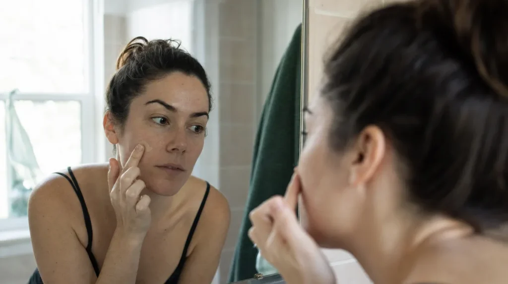
Most people shop for blush the way they’d shop for paint by matching the can to the wall instead of the trim. You end up choosing a color that looks correct against your palm, which is not the surface the blush will actually sit on.
The faster method: tilt your jaw toward a window in daylight, not overhead fluorescent light, and look at the thin skin just under your eye where veins show. Greenish veins generally signal a warmer undertone; blue or purple veins lean cooler. Neither reading is exact, but it narrows a wall of options to a handful worth testing.
A 2019 survey published in the Journal of Cosmetic Dermatology, covering 310 women across five skin tone groups, found that undertone mismatch was the single most common reason respondents abandoned a blush after one wear, more common than price or scent. Shade name on the packaging was a poor predictor of flattery across different skin tones, since “rose” or “berry” means something different on fair skin than on deep skin.
The mistake almost everyone makes is testing on the back of the hand, which has thinner, often paler skin than the cheek. Test instead where the product will live: high on the cheekbone, blended toward the hairline, and give it two full minutes before judging, since cream formulas often look more saturated wet than they do once they’ve set.
Reading The Ingredient List Before The Shade
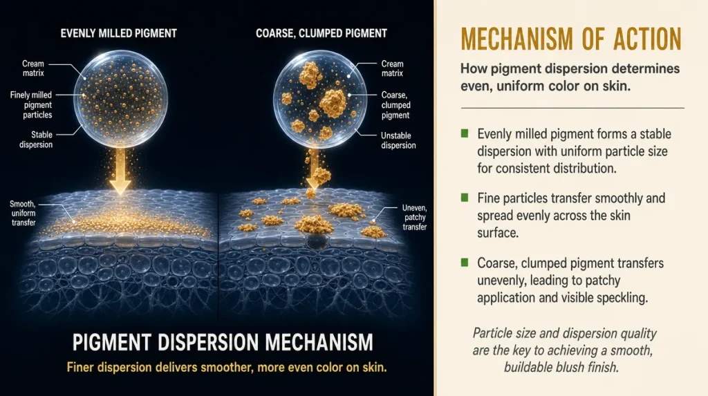
Think of pigment in a cream blush the way you’d think of sugar in a sauce. Dissolve it evenly through a base and you get consistent sweetness in every spoonful. Let it clump, and you get a bite that is overly sweet next to one that is bland.
Cream blush pigment has to be dispersed through an oil-and-wax base, and how evenly that happens determines whether the color goes on in one smooth layer or shows up patchy, with small darker flecks where pigment settled. Ingredient lists won’t spell out dispersion quality directly, but position matters: if a dye or pigment (often listed as a CI number, like CI 15850) appears very early in the list relative to the oils, the formula is likely pigment-heavy and will build color fast, sometimes too fast for a light hand.
A 2021 study in the International Journal of Cosmetic Science, which evaluated pigment particle size across 24 cream-based cosmetic samples, found that smaller, more evenly milled particles produced more consistent color transfer and were rated as “blendable” by a trained panel significantly more often than coarser dispersions. You cannot measure particle size at a shelf, but you can approximate it with your finger: rub a small amount between two fingertips. A gritty or separated feel usually signals coarser milling; a smooth, almost melting feel suggests finer dispersion.
The American Academy of Dermatology’s general guidance on cosmetic patch testing is worth following here too: test any new cream formula on the inner forearm for 48 hours before applying it to the face, particularly if your skin reacts easily to fragrance or dye.
The Three-dot Blend Test
Before buying, or before deciding whether a pot already in your drawer deserves another chance, run what makeup artists sometimes call the three-dot test. Place three small dots of product high on the cheekbone, cheekbone center, and just above the apple of the cheek. Pat, don’t rub, using a fingertip or damp sponge, starting from the outer dot and working inward.
A well-balanced cream blush should need no more than ten to fifteen seconds of patting to disappear into the skin without leaving a visible edge. If you’re still dragging it at thirty seconds and getting streaks instead of a soft gradient, the formula likely sits too heavy on wax relative to oil, which slows how it melts into the skin’s natural warmth.
The mistake most people make here is applying with fingertips straight from a cold product. Cream blush warms and softens with body heat, so a few seconds rolled between two fingers before application lets the wax begin to soften, which makes blending noticeably easier. Letting a pot sit in a cold bathroom overnight, then applying straight out of a chilly drawer, is a common reason a normally fine formula suddenly behaves badly.
If color still looks patchy after a proper warm-up and a full blend, the problem is almost always the pigment dispersion discussed above, not your technique.
Why The Shade In The Pot Isn’t The Shade On Your Face
Cream blush oxidizes, in a mild, cosmetic sense, the moment it meets skin. Oils and waxes in the base interact with skin’s natural oils and slightly warmer temperature, and some pigments shift subtly as a result, usually warming a shade by a small but visible degree over the first twenty to thirty minutes of wear.
This is closer to how a cut apple slice turns slightly brown at the edges than anything dramatic: a small chemical shift, not a flaw. But it explains a common complaint, that a blush looked pink in the store and looked more orange or muted by midday.
A formulation-science review in Cosmetics journal (2020) noted that iron oxide pigments, common in blush formulas for their skin-like warmth, are more prone to this kind of visible shift than synthetic dyes, which tend to stay more stable but can look flatter and less natural on skin. That’s a genuine trade-off, not a defect in either direction.
The practical fix: test color at the store, then check it again after twenty minutes of wear, ideally after walking around rather than sitting still, since body heat and movement both speed the shift. If a shade reads true after that window, it will likely read true all day.
What Realistic Wear Time Looks Like
Expecting a cream blush to look identical at 8 a.m. and 8 p.m. sets an unrealistic bar. Cream formulas are designed to sit on and blend with skin’s own oils, which is exactly what makes them look natural, and exactly why they fade and shift faster than a powder that sits more on top of the skin.
Climate changes the math. On a humid East Coast summer afternoon, oil-based cream blush can slide slightly by midday as skin produces more of its own oil. In a dry winter month with indoor heating running constantly, the same formula may hold its placement longer but can look slightly more matte or chalky as the skin underneath loses moisture.
A reasonable baseline, drawn from general wear-testing standards used by beauty labs, including the kind of methodology Good Housekeeping’s Institute publishes in its own lab reports, is four to six hours of visible color before a touch-up is needed on normal skin, shorter in humidity or on oilier skin types, longer on dry or mature skin.
The mistake is judging a blush as “bad” after one wear in an unusually hot or dry week. Judge it across at least three wears in different conditions before deciding whether the formula or the weather is responsible.
Finish: Dewy, Satin Or Matte, And What Causes It
Finish is not a marketing decision, it’s a ratio decision. Picture butter left on a counter versus a block of wax: butter softens and spreads with warmth, producing a glossy, slightly wet look; wax holds its shape longer and sits flatter on a surface. Cream blush finishes sit somewhere on that spectrum depending on how much oil versus wax and silicone the formula contains.
A dewy finish usually means a higher oil content, which reflects light and looks fresh but can also migrate into fine lines or fade faster on oilier skin. A satin finish sits in the middle, usually a balanced wax-oil blend. A matte cream blush, less common but increasingly marketed, typically relies more on silicones or powder-like fillers to flatten shine, which can also mean it grips less evenly to very dry skin and looks patchy there.
None of these finishes is objectively better. Dry skin in a heated winter apartment generally looks better with a dewier formula; oily or combination skin in a humid month often holds a satin or lightly matte formula longer without sliding.
A simple self-test: press a clean finger into the product in its pot. If it leaves a glossy indent that slowly smooths itself out, the formula is oil-forward. If the indent holds its shape and looks slightly flat, it’s leaning more wax or silicone based. That five-second test tells you more about likely finish than any word on the label.
Mistakes That Make Cream Blush Look Patchy
The most common mistake is simply using too much. Cream formulas are concentrated, and a pea-sized dot per cheek is usually enough for a visible flush; most people apply closer to a dime-sized amount and then fight to blend it out.
The second mistake is applying blush before foundation has set. Cream products slide more easily on top of other wet or tacky cream products, which causes streaking and uneven color grab. Waiting sixty to ninety seconds after foundation, enough for it to set slightly, usually solves this without needing a different blush entirely.
The third mistake is using dry fingertips on very dry skin, which can drag and create a mottled, uneven patch instead of a soft wash of color. A lightly damp sponge, or fingertips with a small amount of facial oil or moisturizer still on them, glides more evenly over dry patches.
The fourth, less obvious mistake is storing cream blush somewhere that gets warm, like a car dashboard or a sunny windowsill. Repeated melting and resetting can separate the oil and wax components over time, which changes texture even though the ingredient list hasn’t changed at all. If a long-loved “holy grail” pot suddenly behaves differently, check where it’s been stored before assuming the formula changed.
Marketing Words Versus What Actually Matters
Certain words on cream blush packaging describe something real; others describe almost nothing measurable. “Buildable” is usually accurate and testable: it means the pigment load is light enough to layer without going patchy, something you can confirm with the three-dot test above.
“Second-skin” or “skin-like finish” is marketing shorthand for a particular oil-to-wax ratio, usually dewy to satin, and tells you about finish, not about longevity or oxidation behavior.
“Clean” is a term with no fixed regulatory definition in the United States, and formulas marketed this way vary widely in oil content, pigment type, and wear time. It says more about which ingredients were excluded than how the product will actually perform on your skin.
“Dermatologist-recommended,” a phrase the American Academy of Dermatology notes is not independently regulated, can mean anything from a formal clinical study to a single dermatologist’s personal opinion, so it is worth treating as a starting point for research rather than a guarantee.
What actually predicts performance, based on everything above, is simpler than any of these phrases: pigment dispersion, oil-to-wax ratio, and how the formula behaves against your specific skin type and climate. None of that fits neatly on a label, which is exactly why learning to test it yourself, in under a minute at the counter or at your own sink, matters more than any word printed on the pot.
Key Takeaways
- Test undertone in daylight on the cheek, not on the back of the hand, and give the product a full two minutes before judging the color.
- Expect a mild, natural color shift in the first twenty to thirty minutes of wear. That shift is a normal chemical reaction, not a flaw in the product.
- Judge finish by pressing a clean finger into the product. A glossy, self-smoothing indent means an oil-forward, dewier formula; a flat, held indent means more wax or silicone, leaning matte.
- Give any formula three separate wears, in different weather or indoor conditions, before deciding it does or doesn’t work for your skin.
- Treat marketing words like “clean,” “second-skin,” and “dermatologist-recommended” as starting points for your own research, not guarantees of performance.
A Two-minute Checklist For The Counter Or The Drawer
- Check undertone against your jaw in natural light, not overhead store lighting.
- Rub a small amount between two fingertips: smooth suggests finer pigment milling, gritty suggests coarser.
- Run the three-dot blend test and count how many seconds it takes to disappear.
- Press a fingertip into the product to read likely finish before you buy.
- Patch test on the inner forearm for 48 hours if your skin reacts easily to new formulas.
This guide offers general information and does not replace advice from a dermatologist or other qualified health professional.
Individual results vary depending on skin type, formula, climate, and application method.